
by Stephanie Forsythe and Todd MacAllen
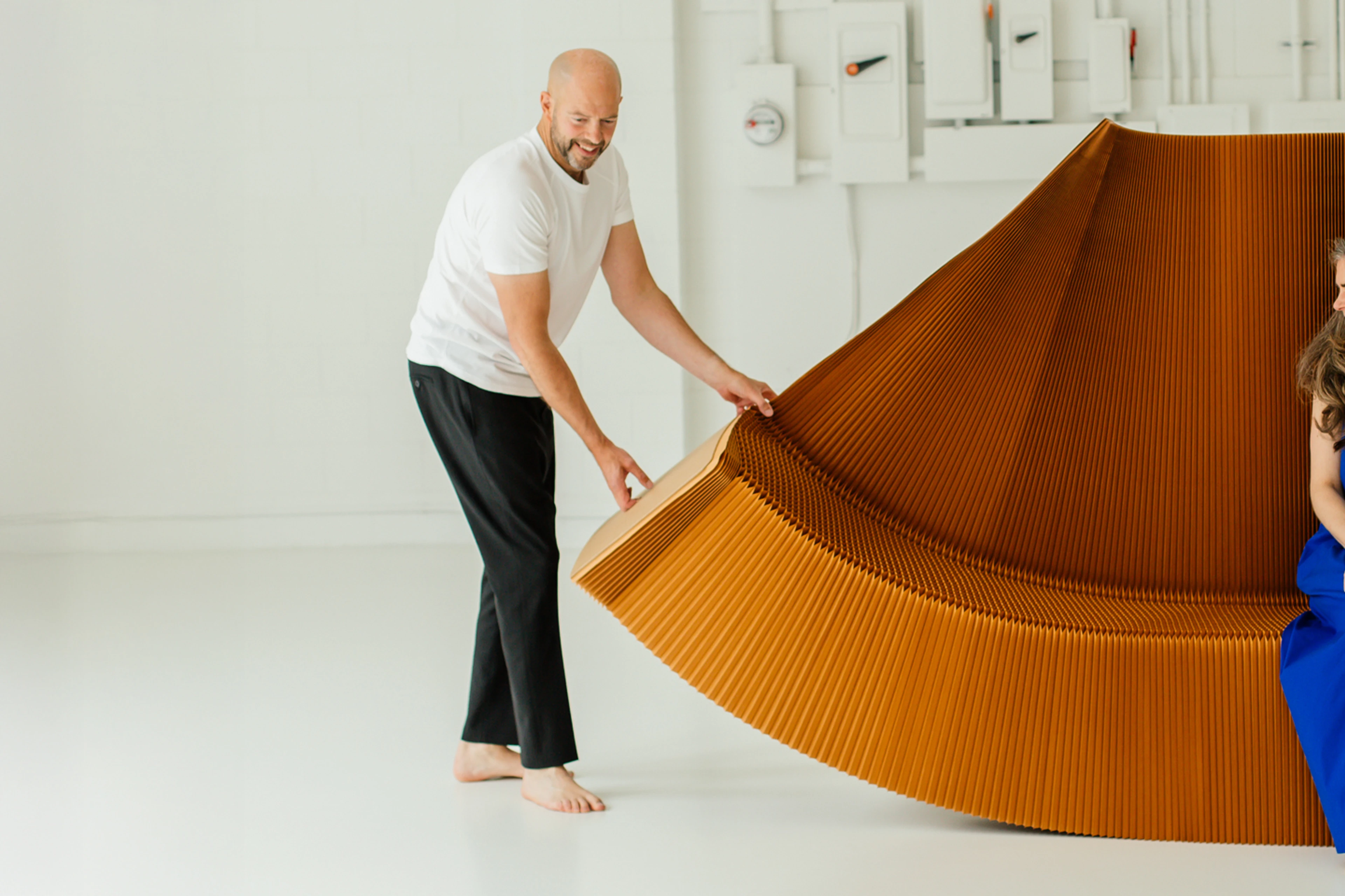
All molo materials are chosen for the way they engage with natural, sensorial phenomena. How a material plays with light, cradles sound, responds to touch, and how it ages, all come into consideration in the design process. When we began our design journey over 25 years ago, the material that we kept coming back to was paper. Visually delicate, deceptively strong, with an abstract, approachable, unadorned beauty, there is a humble eloquence in paper that we can not resist.
As we sought to expand the colour offering of our collections, we meticulously researched the best suppliers. Our performance criteria were demanding: high environmental standards with third party certifications, bleedproof, vibrant, fade-resistant colours, durable over time, and recyclable, with international fire-resistance certifications.
The decision was easy when we found the inimitable Gmund, winners of the German Sustainability Award 2026. We are proud to partner with the Gmund team to develop our new collection.
at the source
Located beside a river in Germany's picturesque countryside, Gmund has manufactured molo’s preferred material for nearly 200 years, honing its craft with rigour and a dedication to environmentally sustainable practices that molo admires and aligns with.
Gmund’s production is entirely powered by hydroelectricity, 75% of which is created by their own turbines on the neighbouring waterway. All wastewater leaves as drinking-quality, cleaned and processed by both the mill and government filtration. Zero solid waste is sent to landfill from the production of Gmund-made paper for molo. Pigments used for colour are eco-friendly, and the paper is FSC® Certified (FSC® C158591).
The two shades of blue paper for molo are made on a machine that has operated for over 140 years, adapted with the most modern technical innovations to ensure quality and protect the environment, including lasers, robotics and the world´s first one-of-a-kind ozone-based water purification plant.
Passionate about their product, Gmund represents a masterclass in sustainability and ingenuity.
new oceanic hues
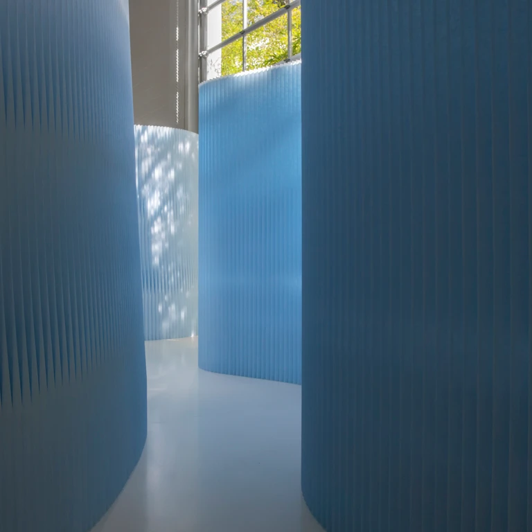
Spending time out on the waters of Western Canada, we have felt especially drawn to explore new shades of blue that could play together through contrasting tones. The shades we are developing this year are translucent glacier blue and opaque deep blue.
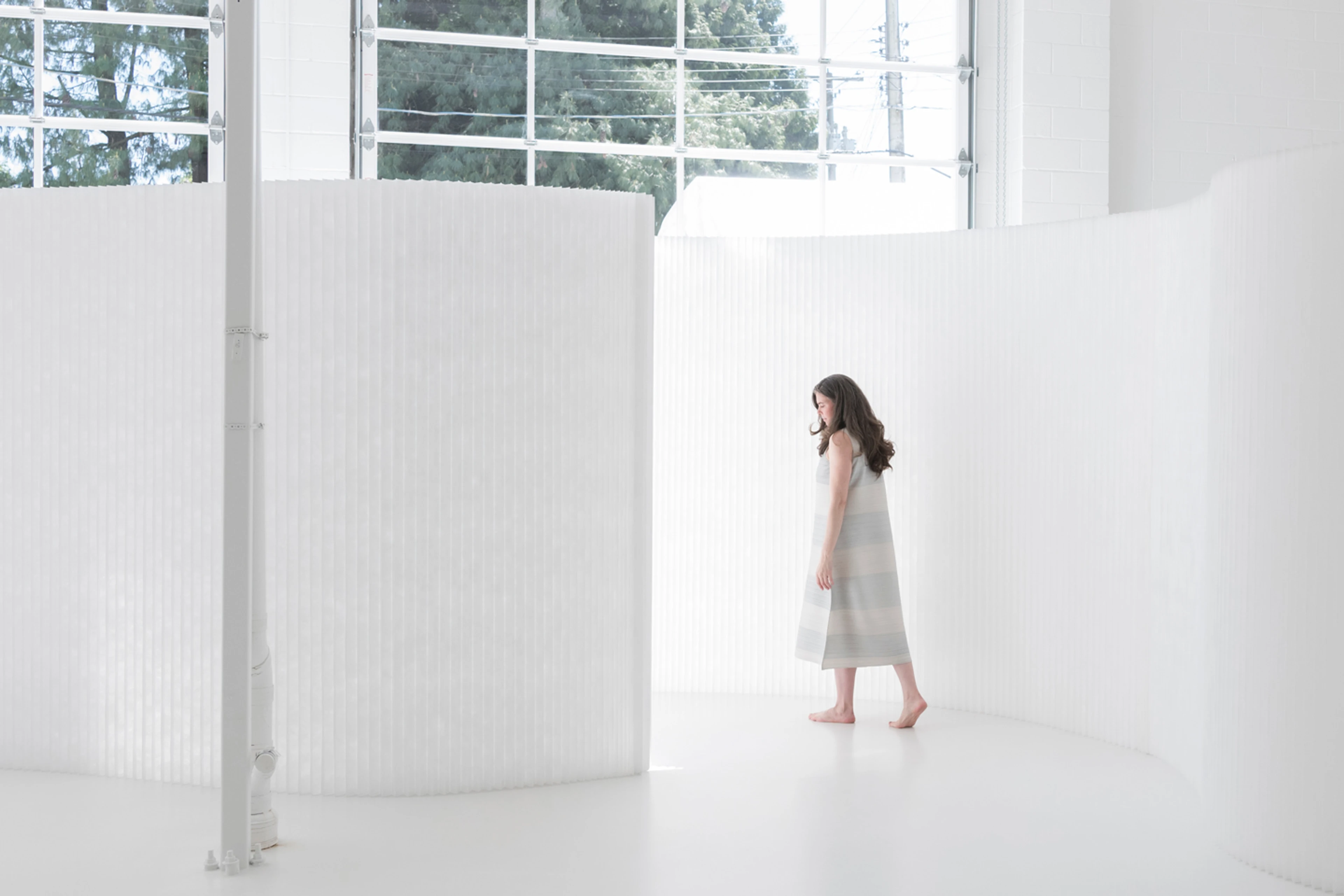
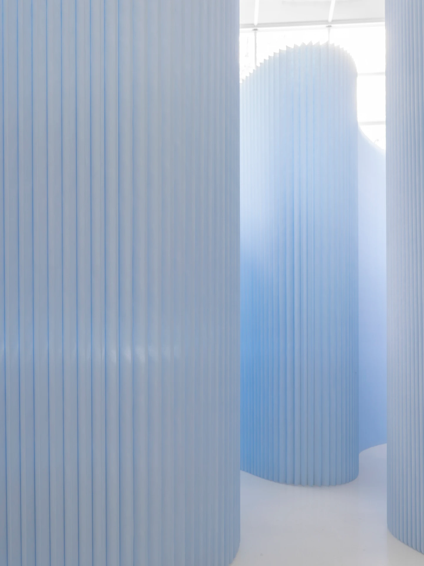
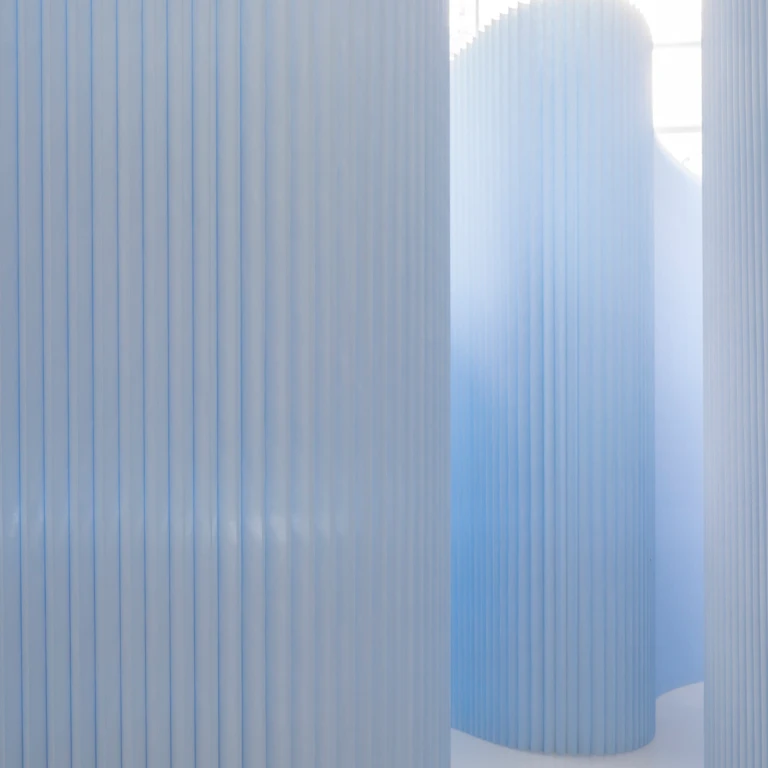
Uplifting and joyful, glacier blue paper softwall conjures the pale blue sky of a clear, sunny day. In direct sunlight, at a microscale, delicate puffs of paper fibre recall wispy clouds. As sunlight passes through the wall, it glows with the ephemeral luminosity of a glacier crevasse.
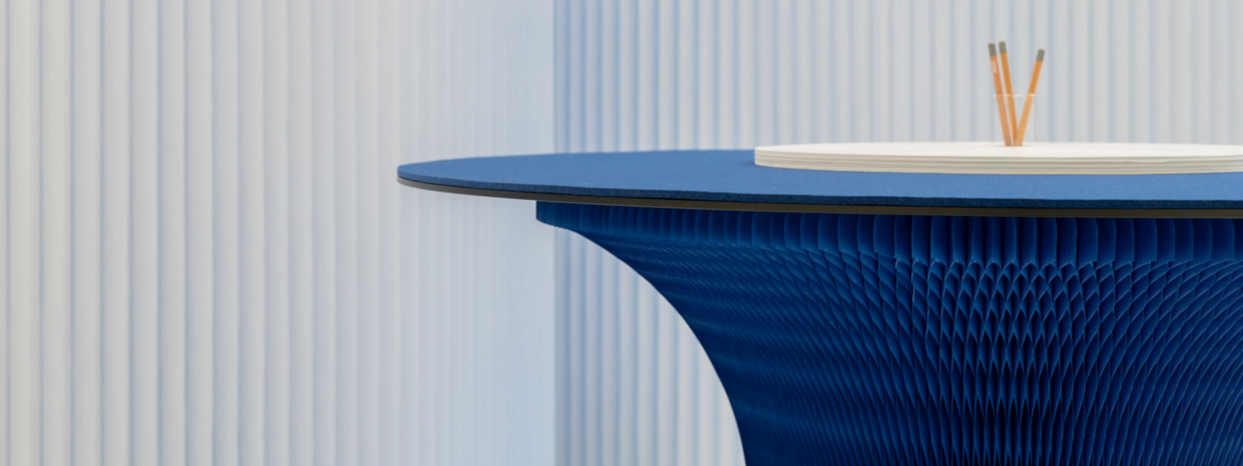
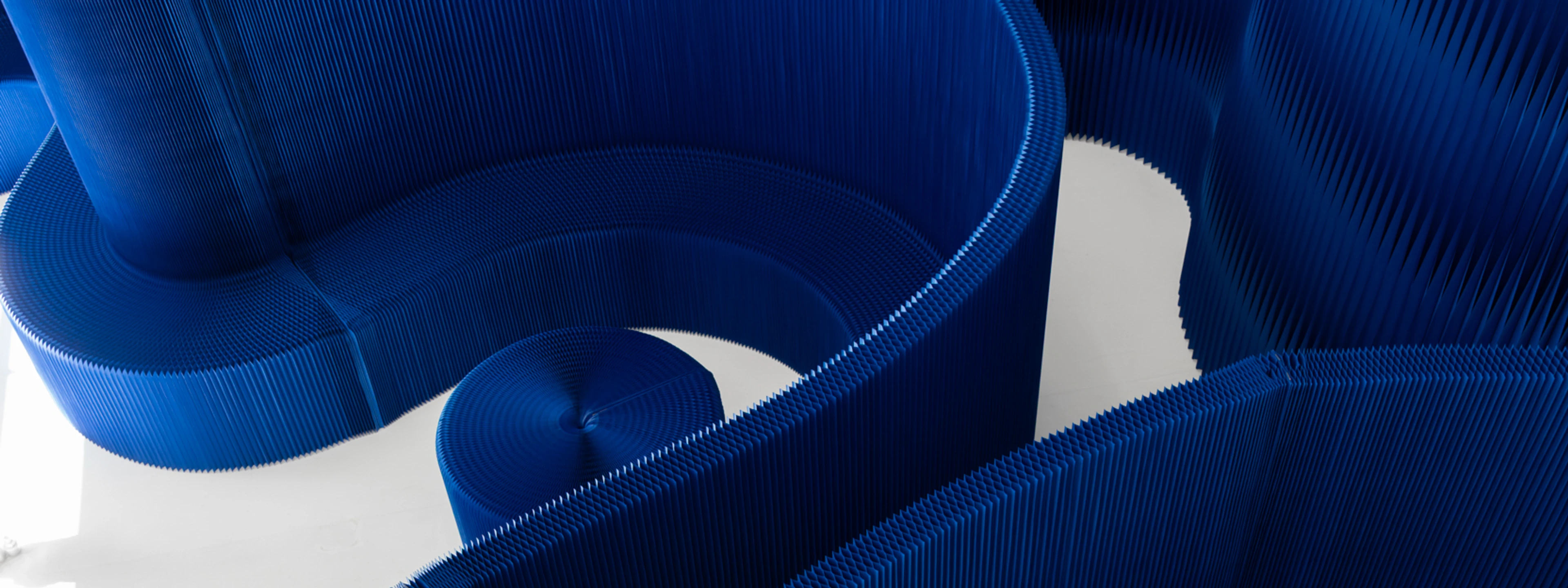
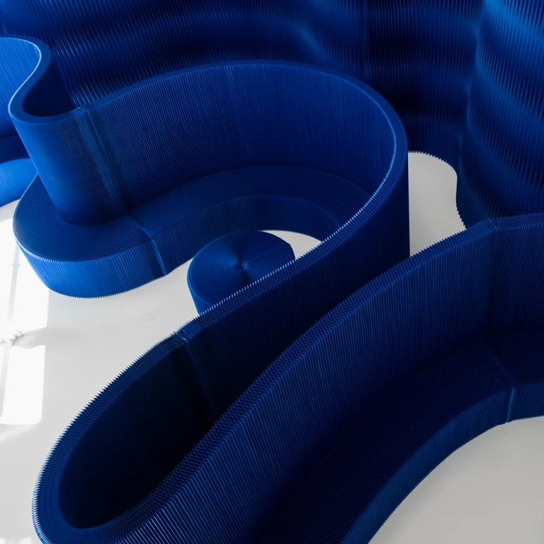
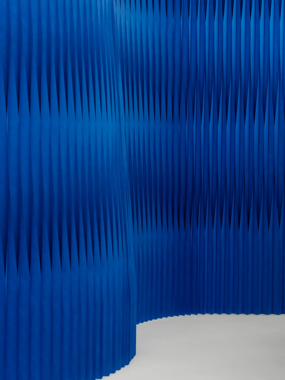
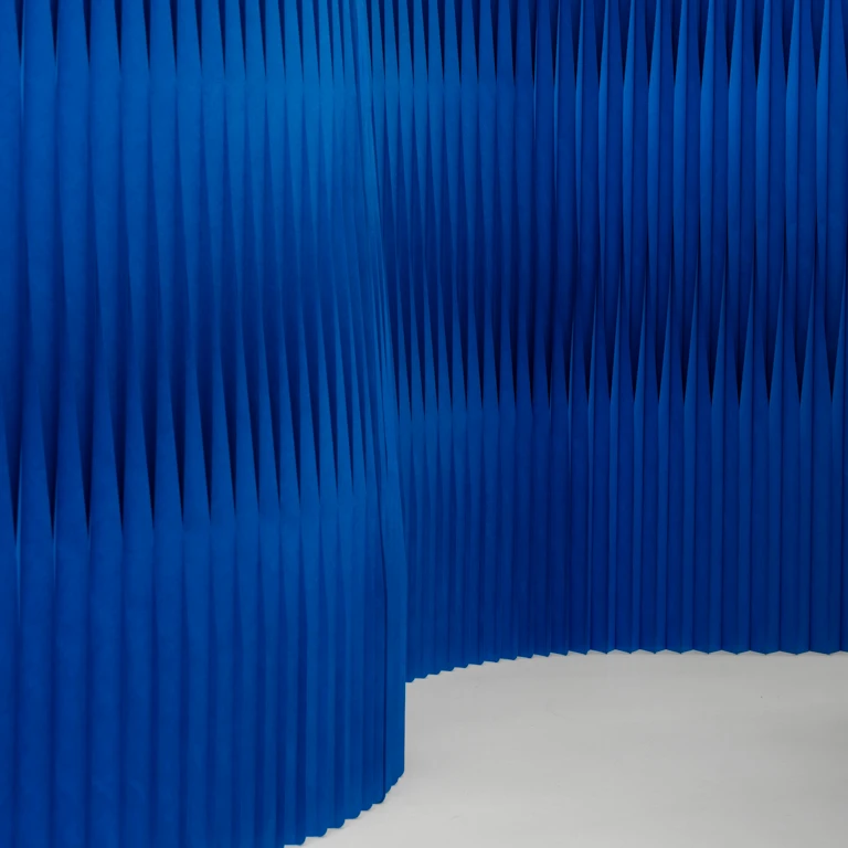
Deep blue, saturated and vibrant, is an evolution of our former blue paper, with a higher degree of lightfastness. When structured with the pleated, cellular geometries of our new sloped softwall, it evokes wind raking the ocean's surface into facets that alternately reflect and absorb light, capturing reflections of sky blue and windows into the shadowy depths.
Together, they are an elemental pairing between sea and sky.
We’re thrilled to share a new collection that demonstrates our values and vision for beautiful, sustainable furniture. We look forward to sharing additional colours in the coming year, and you can learn more about our partnership with Gmund, the new colours, as well as the new products in our official press release.