by Stephanie Forsythe and Todd MacAllen
Colour theory is a central tenet in design and art. It helps us understand how colour works and its influence on the way we behave and relate to the world around us. The study of colour, also known as chromatics, is foundational to our design process. The interplay of light, colour and emotion is integral to our ongoing investigation of multisensory space-making. In this issue, we are exploring ways in which colour affects the human experience.
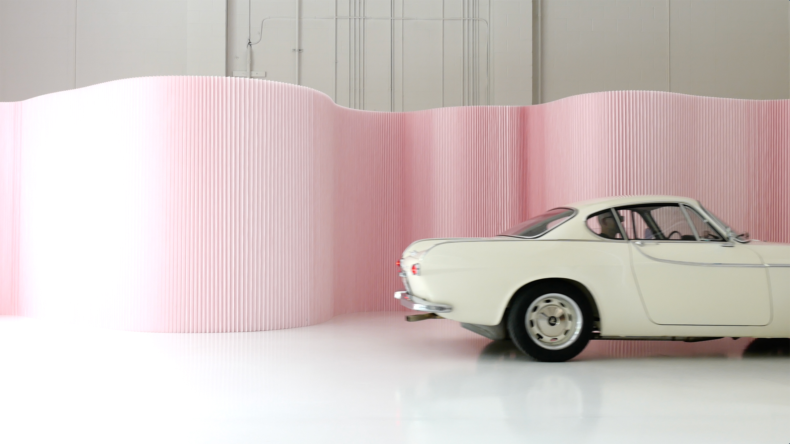
Our softwall + softblock mobile partitions are an engaging medium to experiment with and experience colour in any space. Light reflects back and forth between the vertical fins and folds of these freestanding walls, amplifying colour and transforming a single shade into a dynamic range of hues that shift as light moves across the partition’s sculptural form.
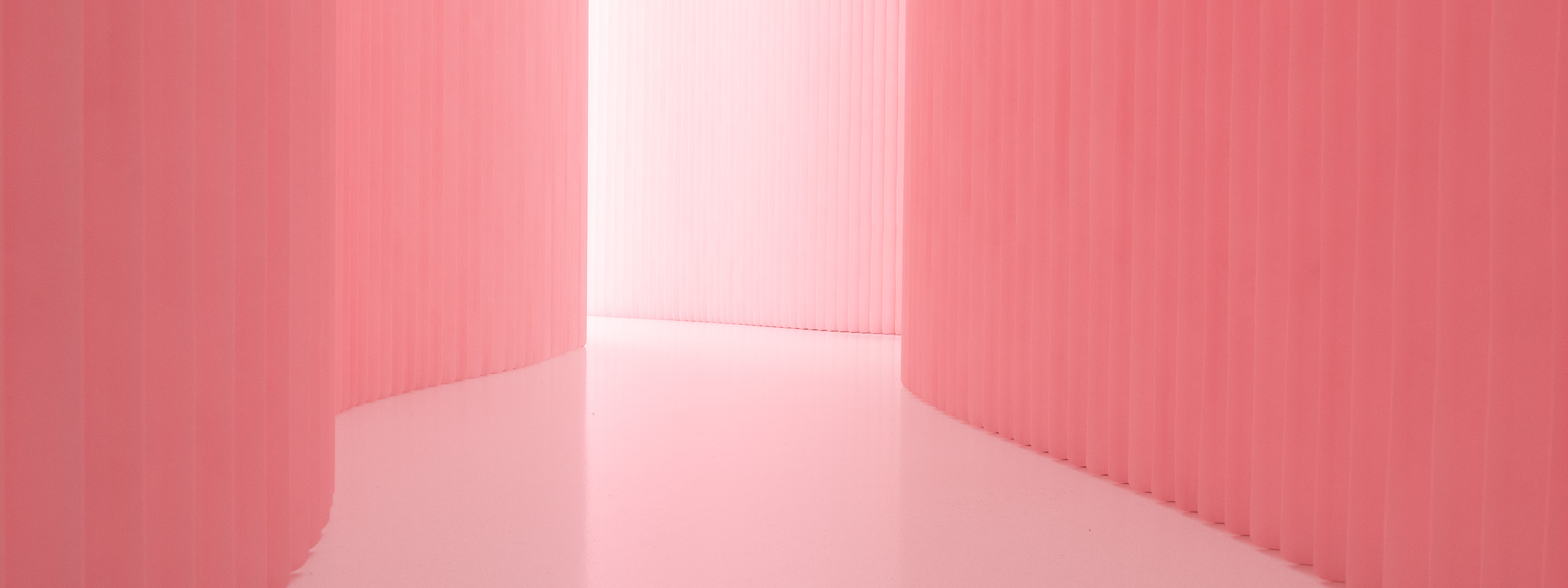
petal pink pantone 12-1305
We chose this very pale shade of pink, knowing that the pleated surface of softwall + softblock would convert it into an emotive array, from saturated and luminous deep pinks to a barely-there blush. The textures of the softwall, when combined with light, bring the colour to life. A similar phenomenon occurs in nature between the pale pink petals of peonies and other flowers, creating a vibrant inner colour.
The warm glow of a space made with these rosy walls is contagious, evoking feelings of joy, calm and tenderness. Passing between pink softwalls we notice that the instinct to smile is irresistible.
Walls of jail cells were painted “Baker-Miller pink” in the late 1970s and early 1980s based on the research of American Psychologist Alexander George Schauss. Also known as “drunk tank pink,” the colour seemed to immediately calm aggressive behaviour and decrease stress.
The appeal of pink is timeless. Enduring and primordial, pink is the oldest known pigment, found in 1.1 billion-year-old cyanobacteria fossils in rocks deep beneath the Sahara desert. Pink is also the colour of new life, and we associate it with the hope and renewal that comes with spring blossoms.
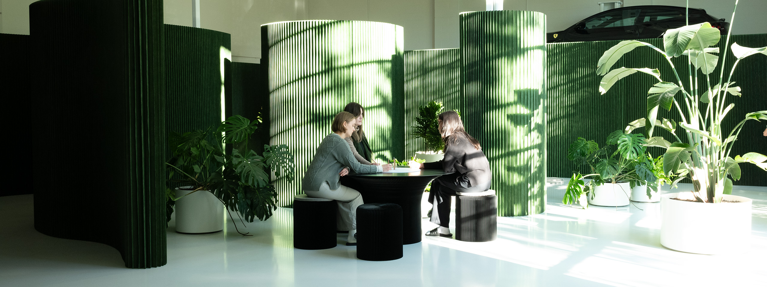
forest green pantone 17-0230
Each layer of forest green softwall is printed with a mossy hue that accentuates the fine fibre pattern of the underlying non-woven textile. The vertical fins and folds of these acoustic backdrops expand the colour pallet, inspired by and evoking the peaceful layered greens and vertical shadows found in the Pacific Northwest rainforest.
The human eye perceives green better than any other colour, and the lack of strain could contribute to its relaxing effects. Green helps students focus in libraries, calms the nervous system in healthcare settings, and reduces stress in office spaces.
As we considered how low-wavelength colours promote restfulness and improve focus, we were intrigued by how forest green, combined with the sound-absorbing structure of our walls and furniture, could mimic some of the benefits of being in a forest environment.
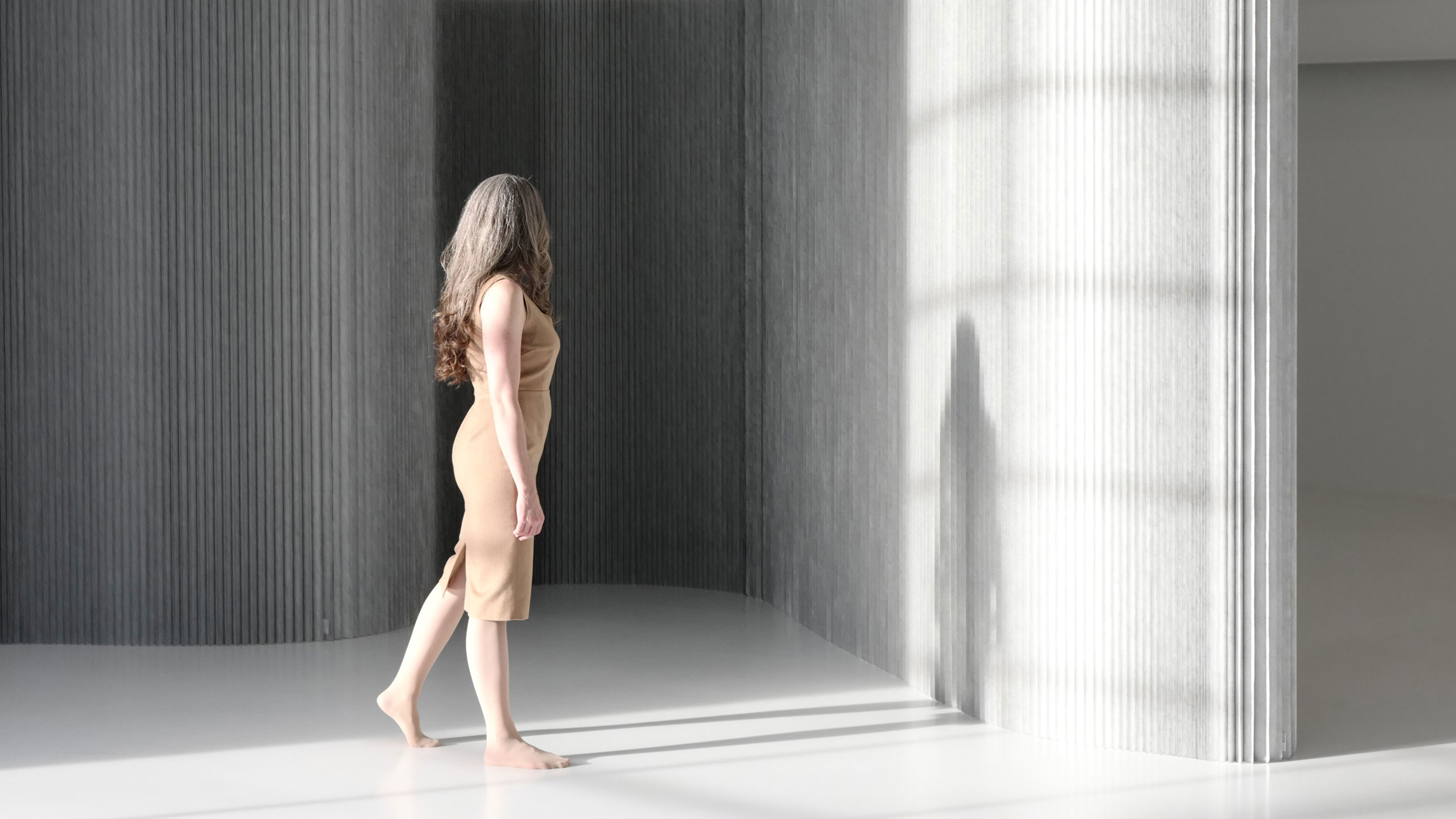
aluminum pantone 877 C · metallic
Aluminum, atomic number 13 on the periodic table, is the most abundant metal in the Earth’s crust. Once considered more precious than gold, this now commonplace material can be found in everything from architecture to airplanes to appliances. In design, it is chosen for its corrosion resistance, environmental benefits, and lightweight, malleable nature.
We apply a micro coating of aluminum to the walls and furniture of our textile soft collection for its optical properties. The ultra-thin metal takes on the visually delicate texture of the non-woven fibre below, and this gives a soft, diffuse quality to the naturally reflective aluminum surface. Reflecting colour, light and shadow, the metallic surface acts as a mirror that interacts with the viewer. Echoing colours from the surrounding environment, aluminum softwall is a sort of chameleon, taking on the warm tones from a wood floor or green projected through the leaves of a tree. Both literally reflective to light and conducive to a reflective state of mind, aluminum textile softwall invites a unique sense of participation as we notice how our presence and sunlight play with the surface, casting shadows and providing a lively yet gentle range of tones as morning turns to night.
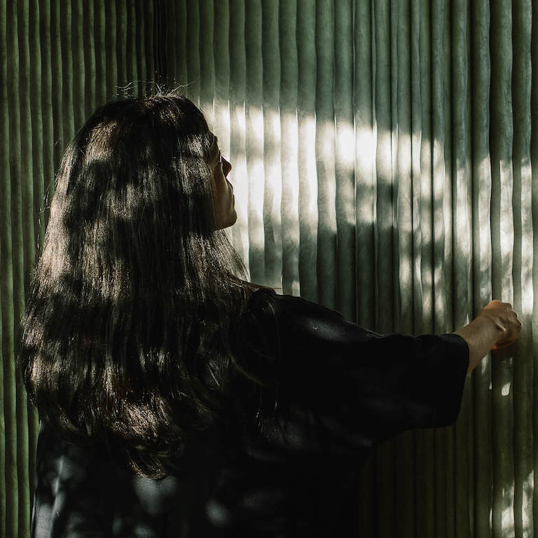 Photo credit, Alana Paterson
see the colours in person
molo at Maison&Objet · September 5th - 9th, 2024
molo will be at Maison&Objet with a completely new exhibit experience. The exhibition explores themes of colour, light, and emotion as part of Forsythe and MacAllen’s ongoing investigations with multi-sensory temporal space-making. The installation will be built entirely from the soft collection in three striking finishes, chosen for how they interact with light and evoke emotion: aluminum textile and limited edition forest green + petal pink textile. See the full story and get free passes here.
molo at Orgatec Cologne · October 22 - 25, 2024
Join us at ORGATEC as we celebrate 20 years of molo! Balancing between art, design and architecture, we founded the molo studio on ideas of flexible design for sustainable living and a series of sensorial, spatial and structural studies for a new building system made from paper. The installation in Germany will be built from our textile soft collection in aluminum and forest green.
Visit us in Hall 4.2 · Stand C-11 · Today · South Entrance
Request free passes to Orgatec at info@molodesign.com


